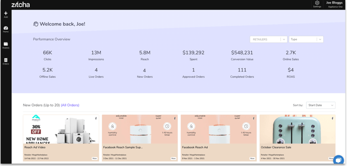
Your Zitcha Homepage is broken down into two key areas for you to easily manage your collaborative marketing activity in one space - the Menu bar and the Dashboard.
Menu Bar
The Menu bar is made up of 2 sections: the left navigation buttons and the top menu buttons.
The left navigation buttons provide a quick way to navigate different sections of the app. These include:
 Add - used to create new orders or invite new users
 Home - used to take the user back to the Dashboard.
 Wallets - used to track and manage order budgets and costs
 Orders - used to navigate to your orders
The top navigation buttons include:

- Settings - used to navigate to your Settings, where you can update your logo and manage your Retailers.
- Your name - this profile button shows the organisation you’re logged in to and is used to log out of Zitcha or switch organisations if you operate more than one.
Dashboard
The Dashboard allows you to easily access a snapshot of all of your collaborative marketing activity in one simple view.
Performance Overview
The Overview section provides a holistic view of all of your Orders and their performance metrics. This is collated data across all time and can be filtered by Retailer or Type.
For individual order performance metrics, navigate to the Orders section from the left-hand Menu bar.

Orders
The Orders section provides an overview of any new order that you have submitted to the Retailer for review. A new order will require action from the Retailer to edit, reject, or approve the order to go live. This snapshot view in your Dashboard is a simple way to view recent activity.
